How Sri Lankan Stilt Fishing Inspired the OpenChoreo Logo

From the southern coast of Sri Lanka, to a sketch on an iPad, to the OpenChoreo logo
If you've come across OpenChoreo, you've probably seen our logo. It is a small stilt structure standing above two wavy blue lines. It looks simple. Maybe a bit weird at first. That's kind of the point.
People sometimes ask what it means, so I figured it was time to write the story down...
Starting from Kubernetes
OpenChoreo is a developer platform for Kubernetes, so when we started thinking about a logo, the obvious place to look was the Kubernetes family of projects.
The word "Kubernetes" comes from the Greek for helmsman or pilot. The logo is a stylized ship's wheel with seven spokes. It is a nautical metaphor for steering containers through the complex seas of distributed systems. Helm picked up the same theme. So have a few other projects in the ecosystem.
I liked that, and I wanted OpenChoreo to belong to the same family. Even metaphors that seem random at first can become iconic when paired with the right story and the nautical thread running through Kubernetes, Helm, and other CNCF projects already had that kind of pull.
What we wanted
When I started sketching ideas, I had a few principles in mind:
- Not corporate looking. Not too serious.
- Something that reflects developer culture, platform engineering, and open source.
- Not afraid to be a little weird.
- Unique and memorable enough to work on swag.
- No mascot.
I also wanted the logo to mean something, not just look nice, but actually map to what OpenChoreo does.
The sketch
Here's what I drew on my iPad:
Hand-drawn iPad sketch of the OpenChoreo logo
Your first reaction is probably: this is a random shape sitting on some waves. Fair enough. Let me explain.
One more small detail: the "OpenChoreo" wordmark under the stilt uses the same font as the official Kubernetes logo. It's a tiny thing, and most people won't notice consciously. But these little details matter. They make the project feel familiar to people who already live in the cloud-native world. A logo isn't just a shape; it's a set of signals.
This design is inspired by the handcrafted stilts used in traditional Sri Lankan fishing. If you haven't seen it before, it's worth a quick image search. It's been done for generations along the southern coast of Sri Lanka. I grew up around this imagery.

handcrafted stilts used in traditional Sri Lankan fishing
The parallel was hard to miss once I saw it, a person standing calmly above the water, focused on their work while everything moves below.
The waves
The waves are everything going on under the hood such as Kubernetes, Cilium, GitOps pipelines, observability, networking, all of it. Dynamic, powerful, sometimes messy.
With OpenChoreo, you don't have to ride the waves. You just need to know they're there, doing their job, while you stay focused on yours.
The runtime environment isn't hidden either. It's visible, accessible, observable. Developers don't have to operate Kubernetes directly, but it's not abstracted away into a black box either.
The stilt structure
Think of it as a simple platform that is just enough for a developer to sit on, do their thing, and stay above the chaos. It's not hiding what's happening below, but it keeps you steady while everything flows underneath.
That's what OpenChoreo is, really. A platform that gives developers space to focus, with the calm and confidence to build.
The voting process
I wasn't the only one with ideas. A few other colleagues at WSO2 also pitched designs, and we ran an internal vote with all of them collected into a single deck. Each design came with a short write-up explaining the concept.
Here's the slide I submitted:
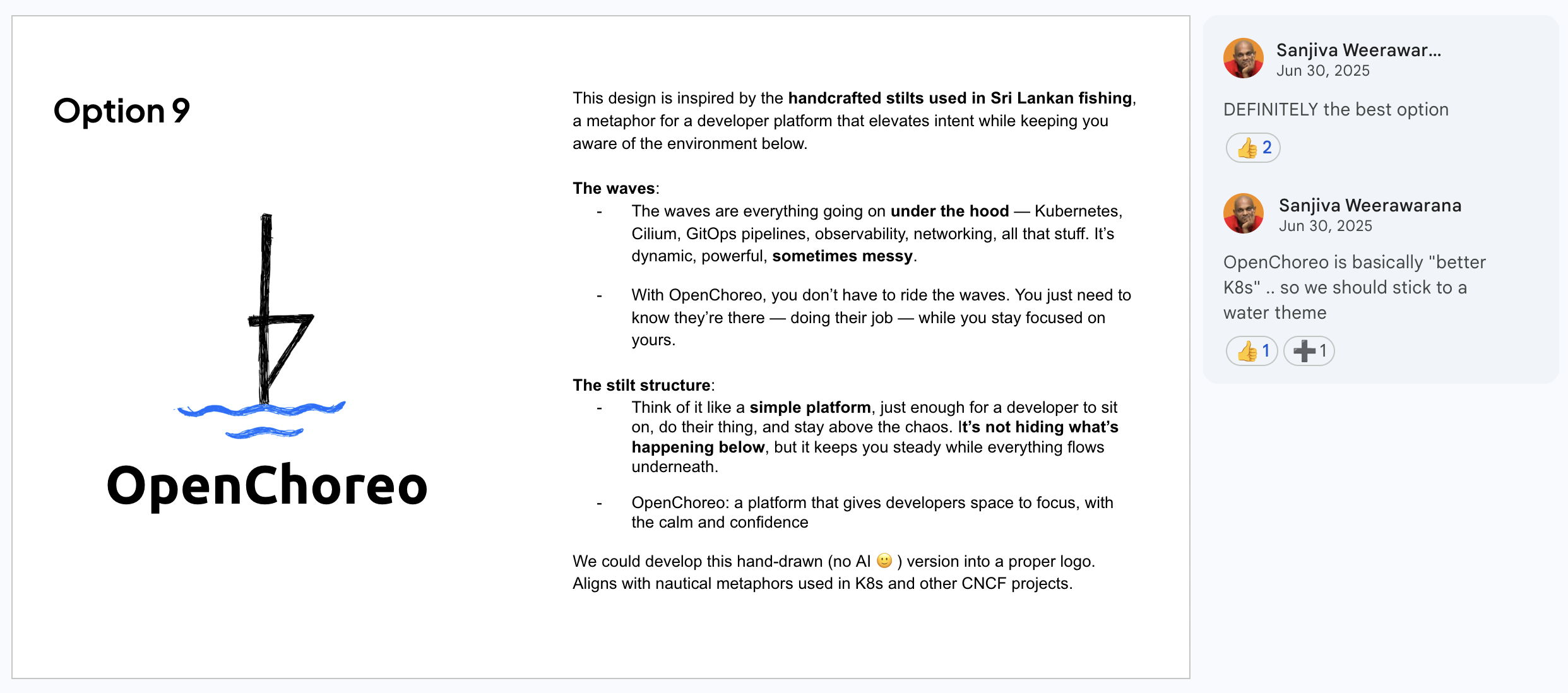
Screenshot of the "Option 9" slide from the voting deck. The iPad sketch on the left and the write-up about waves and stilt structure in the middle
Sanjiva's reasoning sealed it. OpenChoreo sits on top of Kubernetes, so it belongs in the same nautical family and the stilt-and-waves design fit that thread naturally.
From sketch to final logo
I designed the OpenChoreo logo - the concept, the metaphor, and the original hand-drawn version. From there, Surani Bandara from WSO2 marketing team took my sketch and produced the polished digital version that's now on the website.
From the sketch on an iPad to the official OpenChoreo logo
Why I'm sharing this
Here is why:
One: I think more open source projects should tell the stories behind their visual identity. The Kubernetes helmsman story is part of why people remember the project. The little nautical thread that runs through CNCF, Helm, the wheel, the wave, is part of the culture. We're adding something to that thread, and I'd rather explain it than have it stay opaque.
Two: I wanted to put the cultural reference on record. Sri Lankan stilt fishing is a genuinely beautiful piece of heritage, and it felt right to bring a piece of that into a project I've put a lot of myself into.
Three: if you're working on an open source project and you're staring at a blank canvas trying to figure out a logo, don't be afraid to be weird. Don't be afraid to start with a sketch. A metaphor that lands is worth more than a polished mark with nothing behind it.
That's the story. Next time you see the stilt above the waves, you'll know what it's about.